1. I Gave the Site a Logo.
The FindLaw site did not have a logo, only the text of the business name. Giving the site a logo adds some basic branding that we can potentially build from in the future. Logo creating in the age of AI is too easy to not have a logo.
The FindLaw Site's "logo"

Not really a logo so much as just the name of the business.


The Logo I Created
Easy color scheme to look at, clean and simple logo.
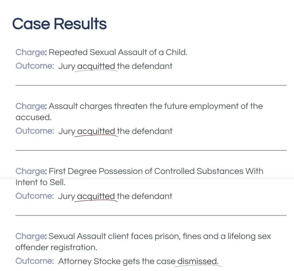
Wins Page
Another example of a little bit of effort and attention to details paying off with a better looking design.
The Old Design
Inconsistent formatting and flat text.
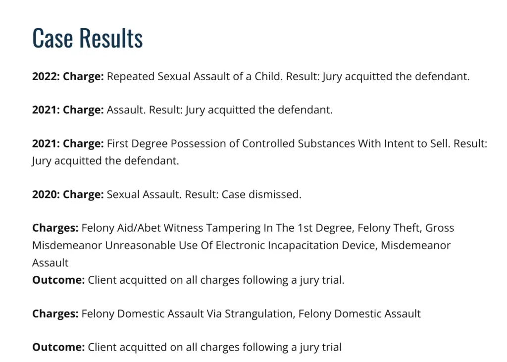
The New Design
Animated headlines let people see the keywords like “acquitted” and “dismissed” even if they are only here for a second or two.
5. Unique Images
I think that having some sort of visual confirmation that you are moving from page to page i important. I also think not having a unique image on each page is just straight up lazy.
The Old Design
Every page looks exactly the same. You can’t tell, but this is rotating 4 different pages.
The New Design
Each page has a unique image confirming the subject of the page.
2. I Fixed the SEO
Same basic title tag on every page.
The FindLaw Site's "SEO"
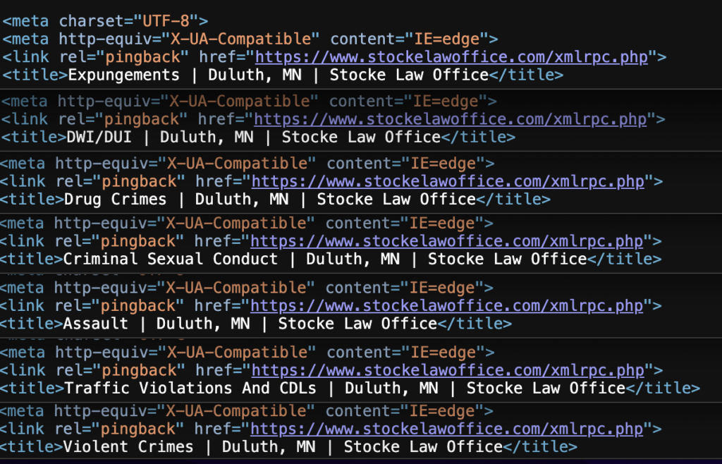
This is difficult to explain, but look at the white text. These tags SHOULD be targeting your most important searches. Instead this looks like an auto-fill situation. Just a huge wasted opportunity at showing up for key phrases.
I wrote a variety of Title Tags
This site’s SEO seemed particularly careless, even by FindLaw’s standards. If you know how to check the title tag on a page, I’d suggest you look through your FindLaw website. Not only title tags, I gave the site some other much needed updates.
This is the Header.
This is a brief explaination of what I did differently.
The Before - The Wrong Way to Do it.
After - I'm Always Right
3. I Improved the Design
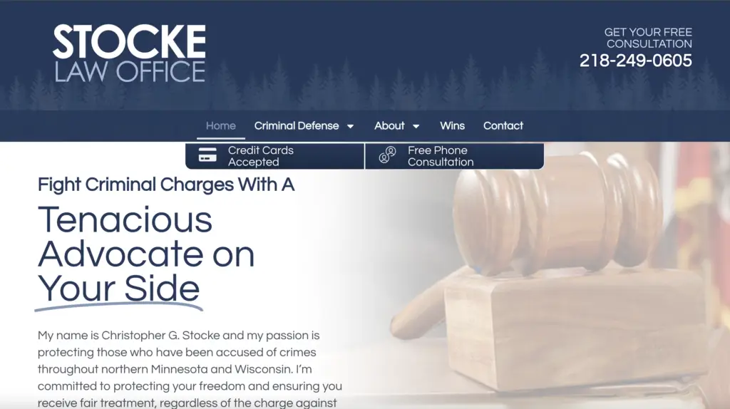
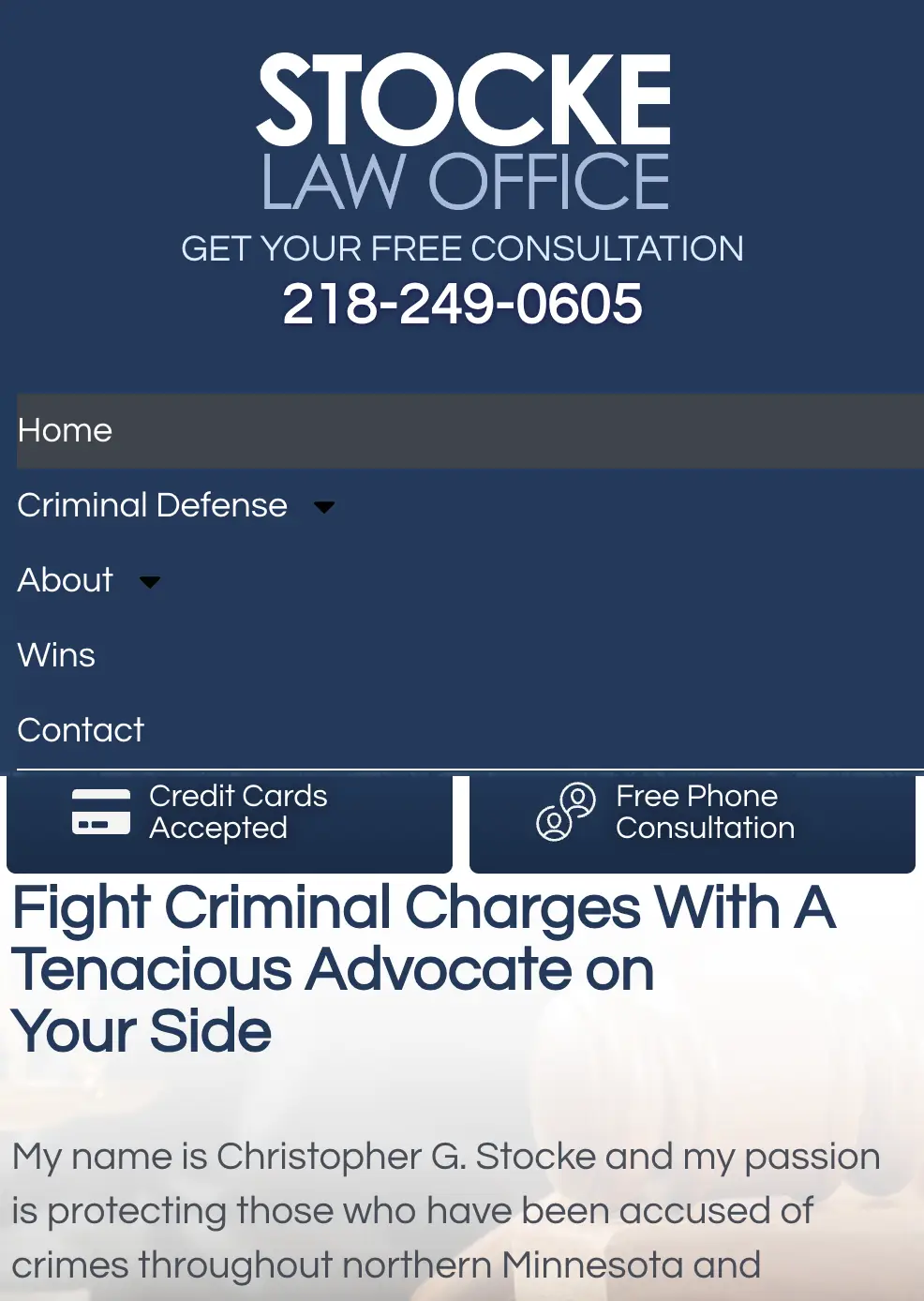
I made the design more interactive.
The Old Design
Here are the two designs side by side. They may look similar but let me p

The New Design
In the new design I tried to give the reader a reason to “keep going” another interesting header to read, another piece subtly moving. Trying to keep the site interesting.


